It’s been a while.
Blog posts have always been something I’ve found difficult. Taking the time and having the gumption is just a big challenge.
But, once done, a post always feels like a useful exercise. So without further waffle I present the witty tie-in:
New starts:
revising the entry journey into 111 online
During early 2022 one of the biggest stumbling blocks for a user upon arrival at 111.NHS.UK was they were seeking something the service simply doesn’t provide:
- straightforward access to primary care
- appointment booking, checking, cancellation
- new prescriptions
- specific COVID guidance, test results, etc
You could hypothesise endlessly why someone would turn up at our front door for “the wrong reasons”, but from feedback and research we knew this issue existed.
Guided entry
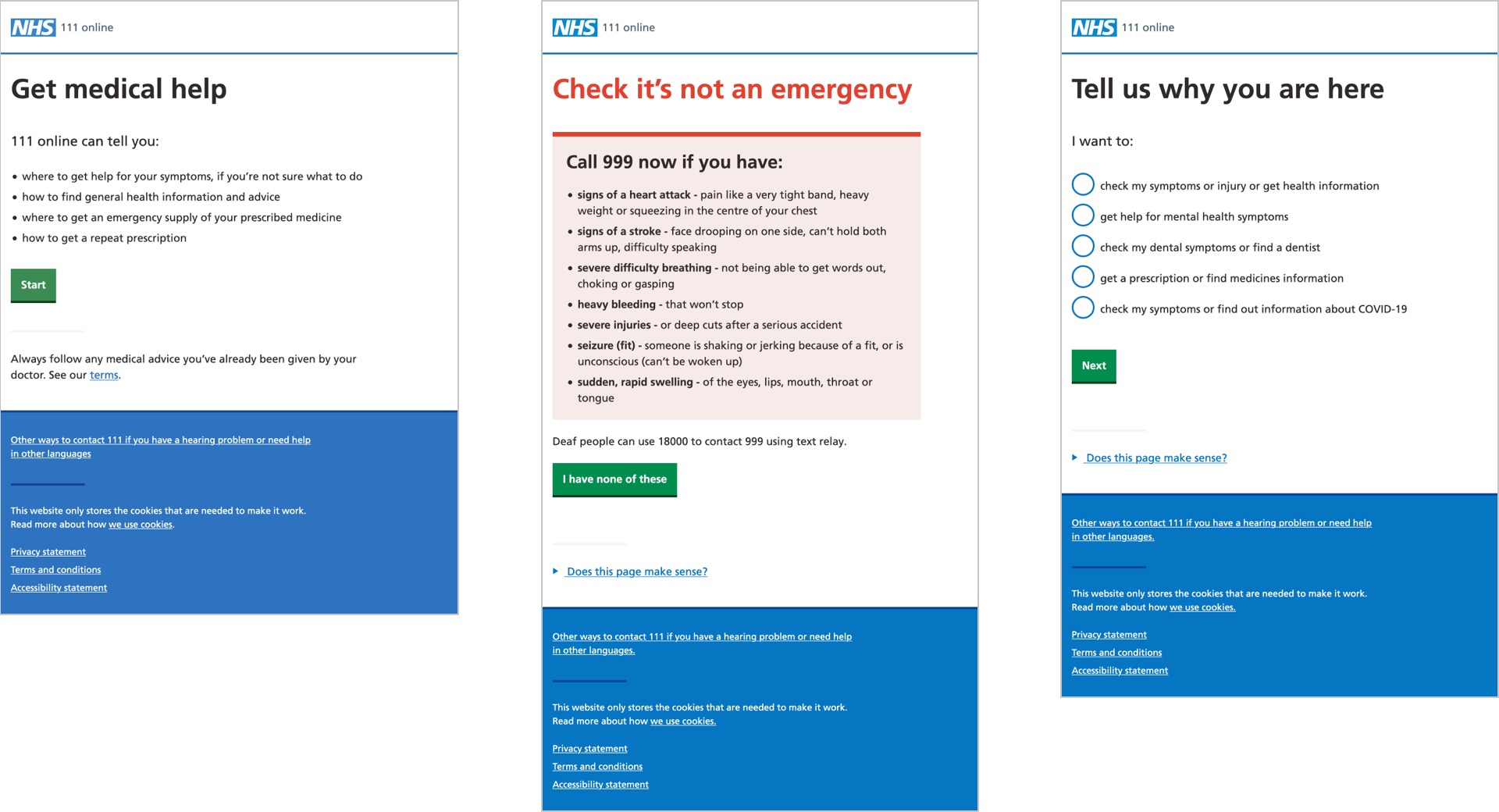
For a while, we used a stage of the journey we called “guided entry”. We knew that some users could be better served elsewhere, and so we built a little interview process into the start of the service:
- okay, let’s start the service
- check it’s not an emergency
- why are you here?

Guided entry allowed us to do a very short interrogation as to why people had started the service.
For example someone looking for information about a specific condition could be better served by NHS.UK. If we could elicit this goal, the user could be rerouted swiftly.
This approach definitely reaped benefits - we saw dropouts reduce in favour of onward journeys to NHS.UK and so on.
Guided entry was a success, but as usual that nagging feeling of “is this really elegant enough?” never really went away:
1. There’s a right way as well as a wrong way
There are “correct” journeys that don’t need interrogation:
- a user landing at 111.NHS.UK via a specifc link from NHS.UK
- using the embedded view of 111 online through the NHS app
2. Hanging onto patterns for too long
111 online has, pretty much since the start, used a transactional start page pattern more-or-less following GDS principles.
Whilst it’s true that 99% of our start page was concerned with introducing our transaction (the triage and associated outcome), over time our service has accreted other, smaller services.
As well as explaining the service proposition and providing information about other available channels, we’d begun to attach hooks into these other services.
Finally, the existence of a point in the user journey that asked “why are you here?” once our transaction had begun was telling us that our reliance on the start page pattern needed to come to an end.
Switcheroo
So we flipped the journey around.
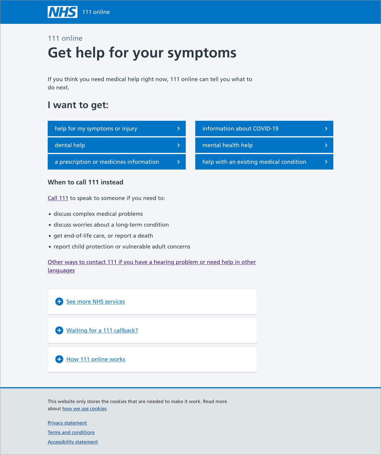
Our service landing page now caters for varying journeys, rather than being a transactional start page.

We used the principle of guided entry to create six primary links:
- help for a symptom or injury
- dental help
- prescription or medicines information
- information about COVID-19
- mental health help
- help with an existing medical condition
These routes lead to further choices and resultant routing in the same way as the previous incarnation but it’s now done up front.
We gained the space and freedom to add elements that didn’t sit well in the austere start pattern:
- See more NHS services - helping users get to services we group as “clerical”, such as appointments, referrals, and vaccinations
- Waiting for a 111 callback - linking to a tiny information service about callback times
- How 111 online works - NHS.UK content about how the whole service actually works
We’re hoping this new work will improve people’s understanding of the central proposition, and also address some of the issues around being directed to 111 but not always for the right reasons.
Improved user journeys
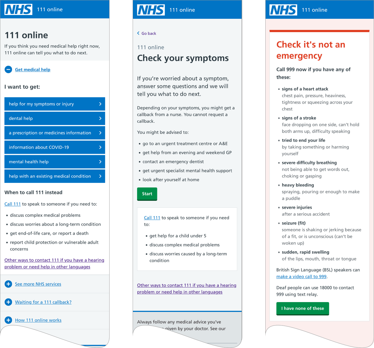
This change gives the user a more natural journey. For example, “I want to get help for my symptoms or injury” starts like this:
- hello, what are you looking for?
- help for my symptoms or injury, okay, let’s check your symptoms
- let’s check it’s not an emergency

Changing the journey like this also provides opportunities for NHS.UK and the NHS app to get people onto triage journeys by linking to triage start pages, and so bypass the decision asked at the front door.
The work we’ve done was put in front of users over a few sessions, and while there were some hiccups and facepalms, we’re generally very confident we’ve done the right thing. Time and further stress-testing will tell.