I wrote about switching up our entry journey into 111 online, complete with a new landing page and thought it would be fun to get into the interaction design weeds and share a clanger. Just to show that 20+ years experience often gets you literally nowhere.
Facepalm
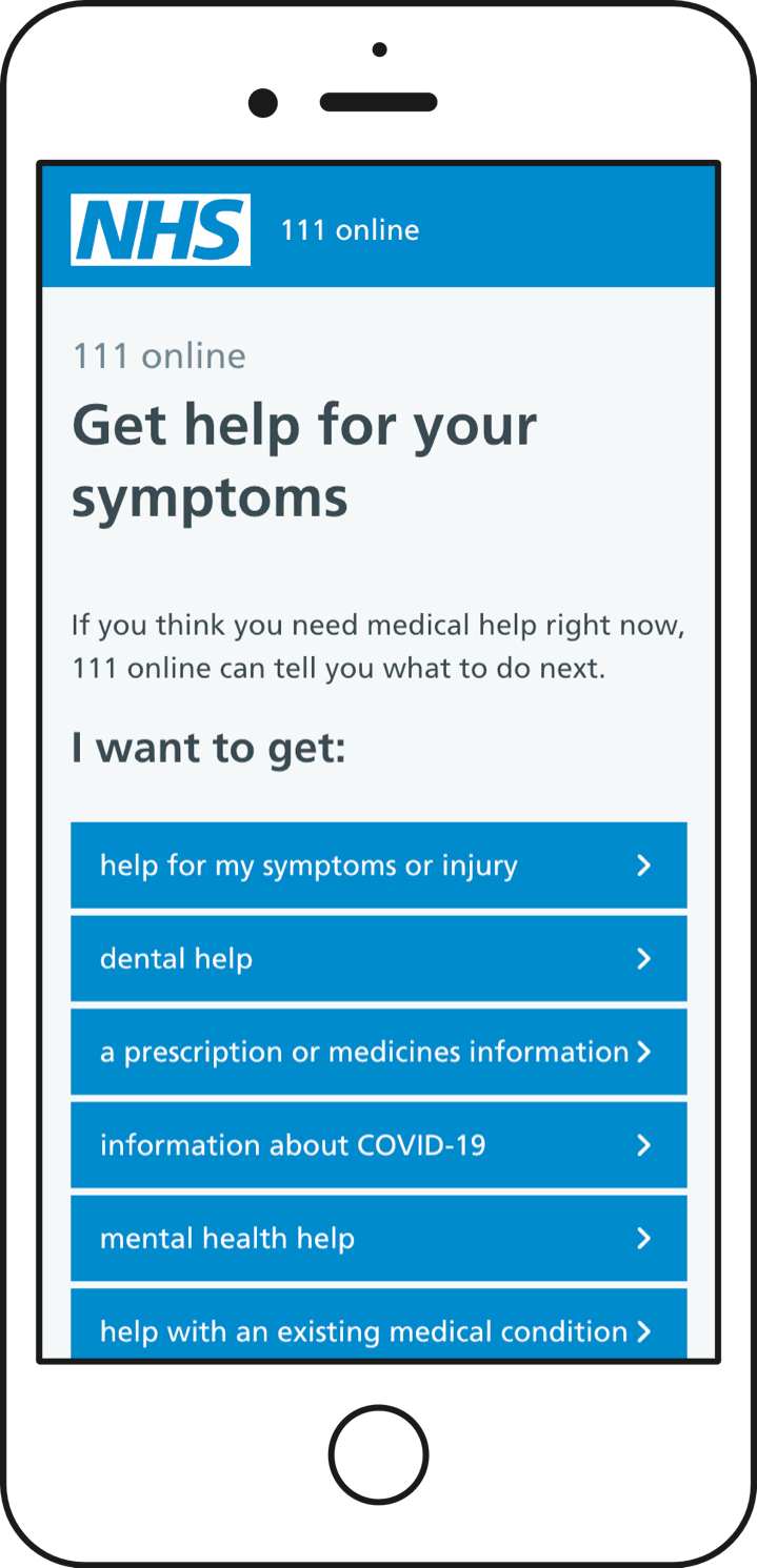
Our new landing page contained six primary options in a single vertical column, representing primary needs from users. In older devices with smaller viewports, those options just about slotted in nicely.
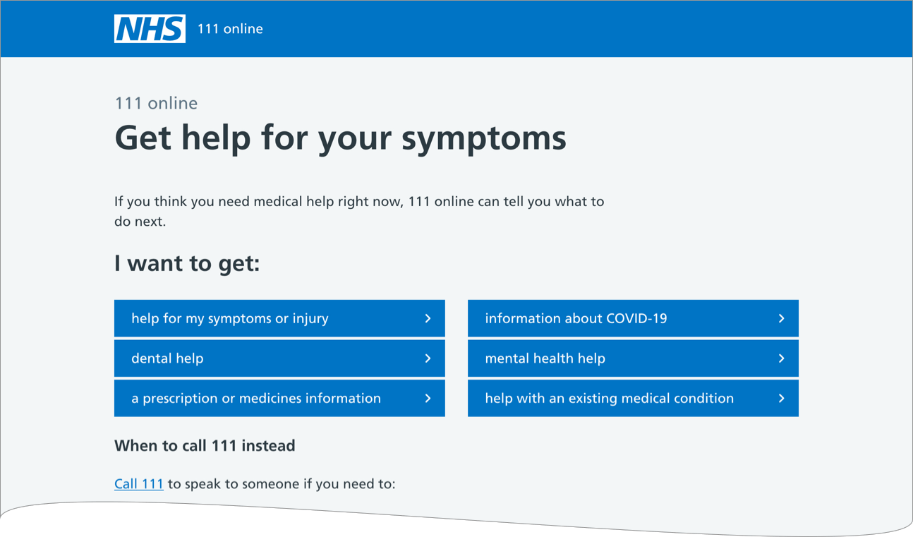
In larger viewports that single column nicely broke into two, reducing the amount of vertical space needed.
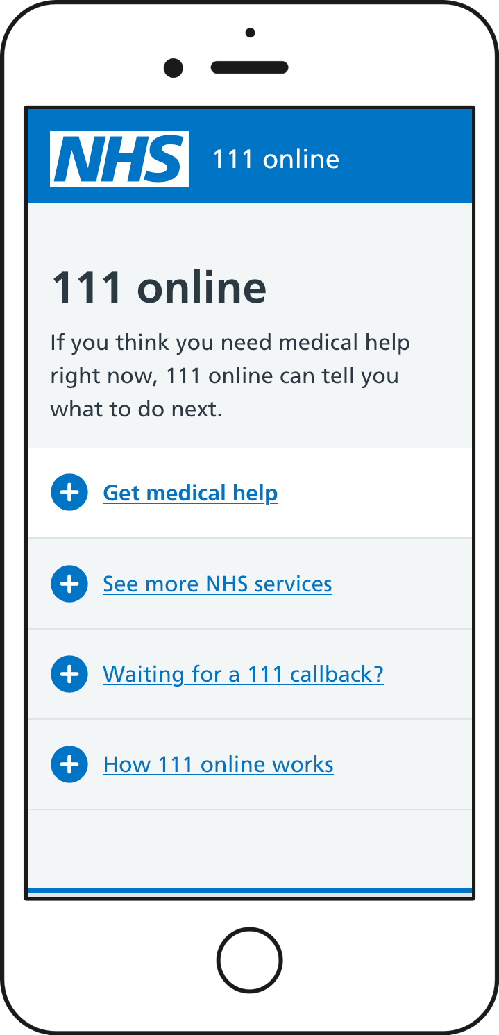
There’s a secondary set of needs that the landing page seeks to meet displayed further down the page, linking users out to other “clerical” services, when to actually use the phone channel, and so on.
I mean, at this point you can probably guess the rest.
In our first usability sessions, desktop and tablet users were completely fine, and have continued to be so since. Winning!
But people using phones just weren’t scrolling. Like, not one. While the primary options worked really well, any time a user needed to scroll down to discover further options they just didn’t.
I’d managed to design an interface that near-perfectly suggested there was no need to scroll.
Gradually removing palm from face
I went through a few daft iterations. You know the kind of thing, hamburger menus, sliding drawers, and so on, borne largely of sunk cost and imposter syndrome.
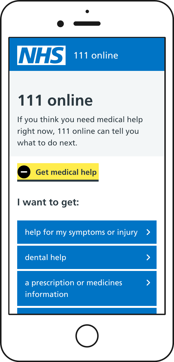
In the end the simplest solution was a pre-existing NHS.UK component which I subverted slightly to weigh the initial option a bit more.
For the first time since the pandemic, we sneaked out and did some pop up testing. We simply grabbed people in the street and got them to load up a prototype on their own phone. Once we’d seen someone initially play unprompted with the revised design, we then gave a scenario to stress test the content and journeys within the initial interaction.
Thankfully people interacted without difficulty. The content of the first expander gave cues to scroll by evidently extending past the viewport. We gained confidence quickly before moving to more “official” and properly recruited usability testing.
I’d forgotten just how invaluable quick and dirty testing like this can be. Seeing someone using their own device, and being able to observe their movements, interactions, body language, as they use a product - with no warning or preparation - makes you realise just how sparse interaction insights from remote sessions can be.
That bit at the end of the post about wisdom, or lack of it
If I am supposed to have learnt anything over the years, it’s to be wary of a neat phrase that runs the risk of reducing a set of subtle and nuanced design decisions into a simplistic “this is nothing to worry about” attitude.
“There is no fold” is a good example. I’ve been guilty of bandying that about, and treating it simplistically.
It’s not wise to simply assume that people will just scroll. People will just scroll if they are carefully given the cues to do so when those cues are needed.
I suppose every once in a while it’s very healthy to get bitten in the ass.