In a previous post I shared a bit about breaking up a big form into multiple tasks. This post will be shockingly similar, the difference being… it’s not a form.
Primary care outcomes
Our service is starting to investigate how (and if) we might link users into some (or all) of the various systems bought into under the GP online consultations fund (GPOC).
If we can fulfil a user need by linking users into systems, we’ll need to be able to do that at the point of disposition. Right now, there’s a lot going on in our primary care disposition views.
Any excuse to simplify
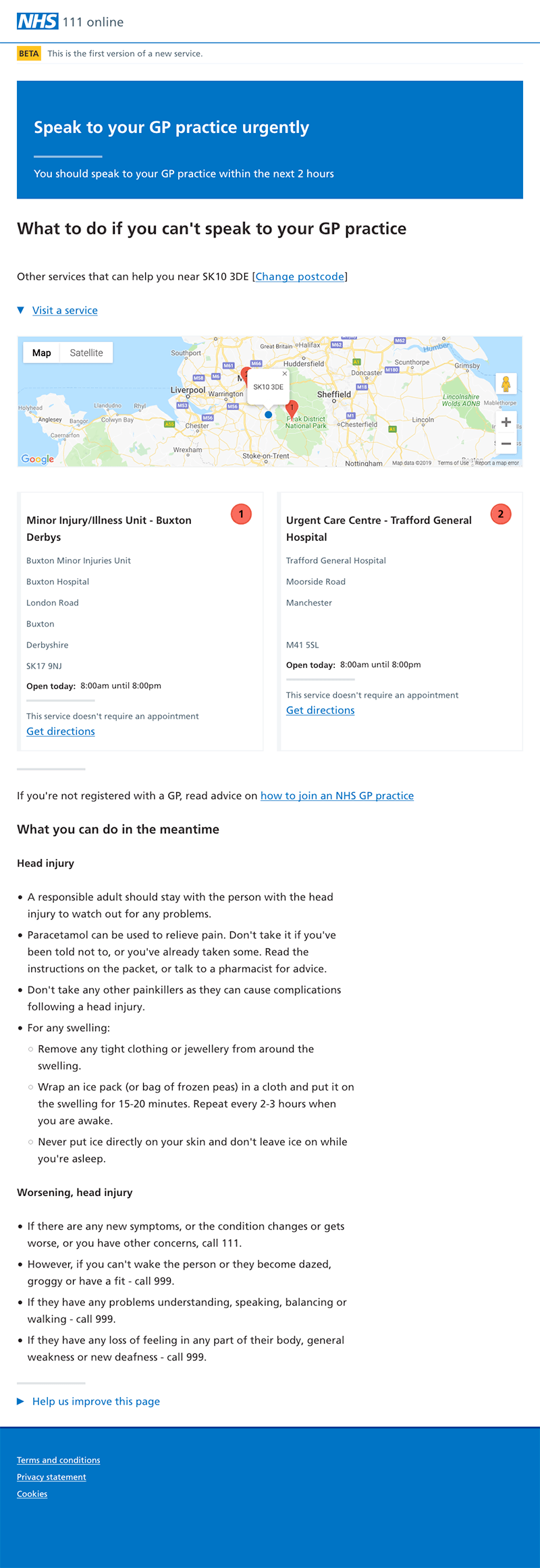
In our primary care dispositions, we lead with a simple message to contact your GP surgery, then provide alternative services if you can’t do that.

It leads to a pretty bloody big page.
If we do want to be able to link people into GPOC systems, trying to shoehorn in that task as well just isn’t going to work.
So joyously this is a good enough reason to revisit these views and figure out how to make them work better for users.
Crit what’s existing
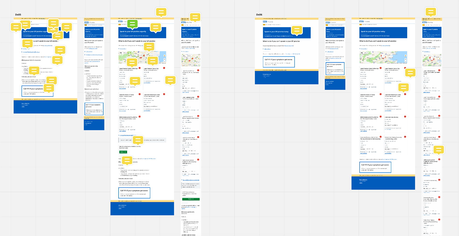
We critiqued the existing views as a whole team. What’s not working? What’s working well?

There’s a lot going on, and the balance of information is wrong - the thing we want you to do occupies the smallest amount of space.
Essentially the existing page provides 5 related things in one place:
- the initial directive: “contact your GP”
- the provision of alternate services that can help
- links to information about registering with a GP
- self-care information
- what to do if things get worse
Those things map to 4 defined needs:
- “I need to understand what I’m being asked to do”
- “I can’t do what I’m being asked to do”
- “Is there anything I can do in the meantime?”
- “What if I start feeling worse?”
Splitting into small simple tasks
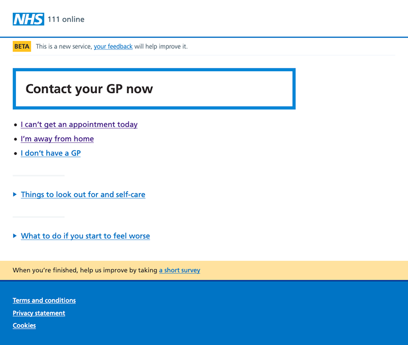
We know that we have a single primary task for the user, and that’s “contact your GP”. If we can present this simply and clearly, we meet our first need: “I need to understand what I’m being asked to do”.
Once the user understands what it is they’re being asked to do, we can then meet the other supplemental needs.

By shifting other tasks into other pages, we’ve made a much simpler clearer page.
We did some quick and dirty comprehension testing in a local library. Basically grabbing people and showing them just this screen, then asking them to explain it.
Everyone we spoke to understood the screen, and there were a few compliments about how the “can’t do” links were written “in the way people actually think”.
Next steps
We should be able to release this simplification as an improvement, while we move into looking at the possibilities of linking users to their GP systems. So that’s nice.