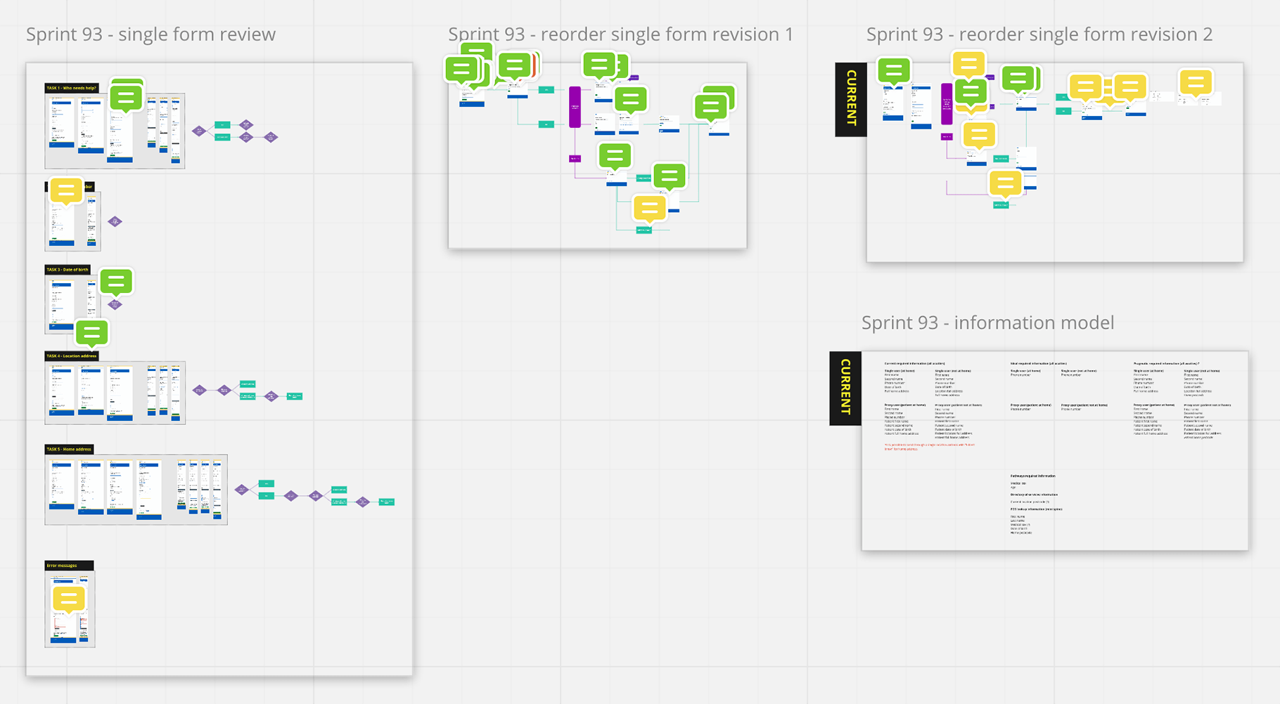
This week’s been mostly about one thing. Planning out the first stage of splitting a big form with multiple tasks in it into a series of simple steps.
Why break up a big form?
Moving to a “task per page” model increases consistency across our service. The big form is actually an aberration. Our service largely sticks to the “task per page” model anyway.
The proportion of traffic we receive from mobile now outweighs desktop. On a mobile long forms become harder to use and navigate, especially if the user makes a mistake. Breaking a large form into smaller steps is a part of designing mobile first.
Our prototypes have shown us that users find the “task per page” model easy to use to complete the set of tasks we require.
Breaking our form down into “one task per page” is just one part of aligning with Government Digital Service recommendations, which have been heavily researched over several years now.
Taking the first step
We know what we’re aiming for (in our prototypes) and we know where we are (the existing form). So we’re planning out how to get from A to B.
The existing form gathers information from the user which is then sent via the Interoperability Toolkit (ITK) standard to urgent care providers. That information is then used by a Clinical Assessment Service (CAS) where a healthcare professional will get back in touch with the user.
As a first step we’ve decided to break out one task from the form as it stands. That task involves the user supplying a location address, and if that location isn’t “at home”, then also supplying a home postcode.
We gather a location address so help can be sent to the right place if required — essentially ambulance dispatch.
We use the home postcode as one part of a Personal Demographics Service (PDS) lookup, which helps services quickly gain access to care records.
Working out how to change the interaction is fun (if you enjoy this kind of thing). It’s involved:
- making sure we understand the tasks within the existing form and how each task works
- mapping our chosen task into the “task per page” model
- understanding the scenarios that come into play
We’ve been doing a lot of that work by visually mapping out the transition:
- Breaking the initial form down into discrete tasks
- Extracting the task we want to separate
- Proposals and revisions to that task and how it works
- Minor revisions to the original form

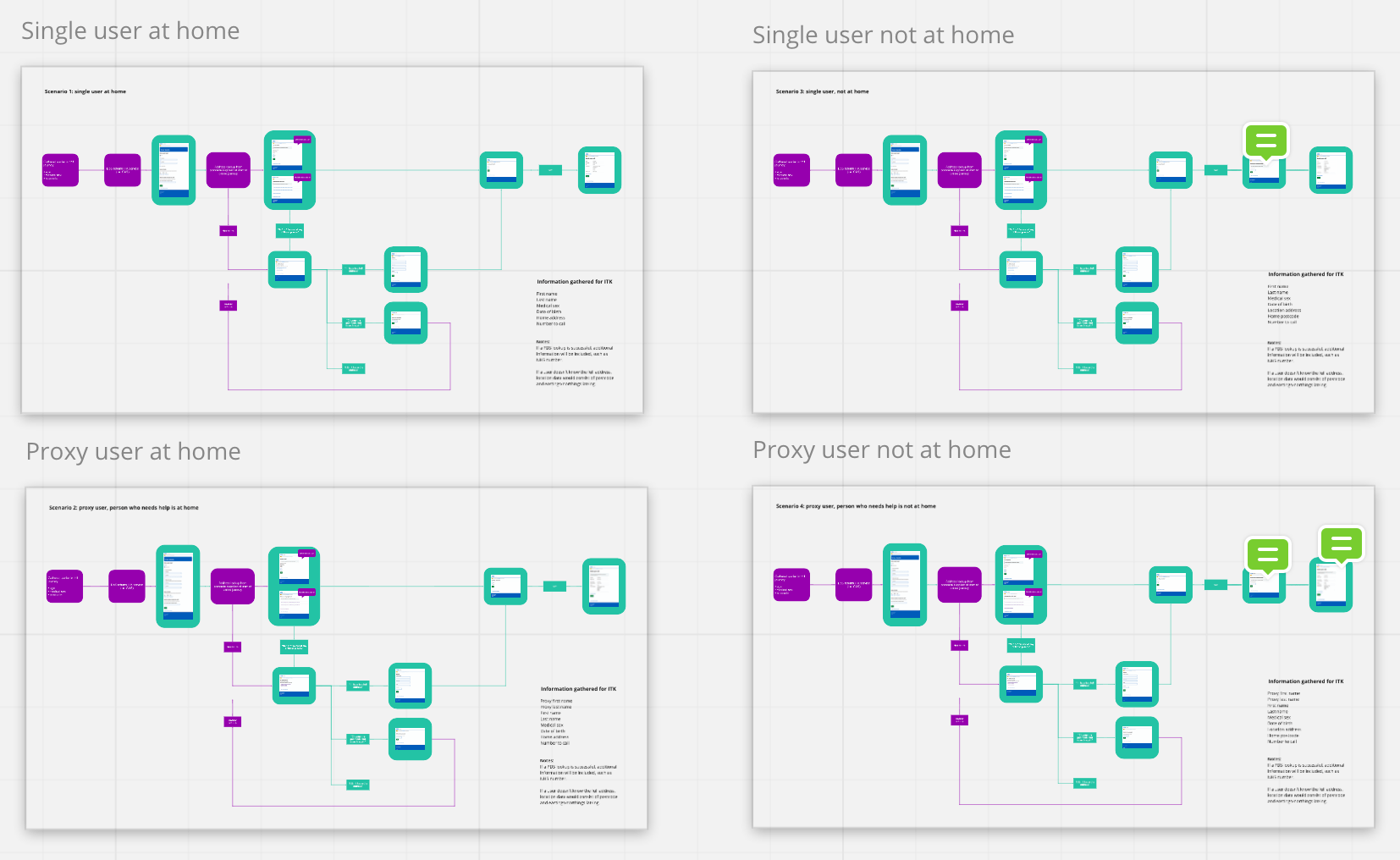
What the work gives us is a process map. The next (well, parallel) stage is to test that map by using scenario journeys. Our user scenarios for this task are:
- a user who’s at home
- a user who’s away from home
- someone who’s helping someone else, at that person’s home
- someone who’s helping someone else, not at that person’s home

All this work is done in front of the team, who comment as we go. It will also be shared for feedback with urgent care providers — the consumers of the information the user is giving us.
Moving on
Doing this work is essentially scoping out the first step of a larger change. It feels healthy to map things out carefully — it means when we build, we’ve got a precise blueprint of what to build. Having that blueprint means we can build and test something well.