Disclaimer: this post has been languishing as a draft for ages. It was originally intended for the NHS Digital blog, but didn't pass muster. Shrugs. Here it is with a bit of a postscript.
The NHS 111 online service asks people a series of questions based on their symptoms to help them decide what to do next — should I see my doctor, go to accident and emergency, or is it okay to look after this myself?
One of the first things I got involved in upon joining the team was looking at how we ask people to choose the appropriate pathway (set of questions) upon entering the service.
What’s the problem?
In order to get onto a pathway, users must search or browse to a pathway that feels right for the symptom they’re reporting. That’s done by searching or browsing the available options.
We had a collection of research interviews showing some people struggling with aspects of finding a pathway. Looking at analytics (in a very basic fashion), in March 2018 we had 9,000 sessions using search. Of those sessions we had a 7% dropout rate from our search pages and 16% of our users needed to refine their search terms.
If users are confused or struggling, they could:
- choose a less suitable pathway, resulting in a lot more questions as they get gradually moved into a more appropriate one
- keep refining their searches, going around in circles
- simply drop out of the service altogether
Scoping the problem
For one two-week sprint, we looked into how we ask people to choose a pathway. Not to write any code or content, simply to examine and define the problem.
What is a pathway exactly?
A pathway is a set of questions about a certain symptom. Those questions aim to rule out serious conditions first — the more questions you find yourself answering, the less trouble you’re in.
A pathway is described like this:
{
  "PW_id": "PW1040",
  "PW_Age": [
    "Adult"
  ],
  "PW_Gender": [
    "Female"
  ],
  "categories": [
    "coughs-colds-and-breathing-problems"
  ],
  "DigitalTitles": "Cold or flu",
  "DigitalDescription":
    "A blocked or runny nose, sneezing, aching muscles, headaches, pain in the
    face and coughing.",
  "CommonTerms":
    "common cold, head cold, respiratory problem, runny nose, streaming cold,
    bug, sniffle, snivel, sore bones, aching bones"
}
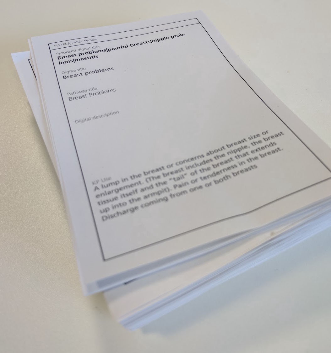
Each of our pathways has a title and a description which are displayed to the user, along with “common terms” which aren’t displayed but are used to catch (no prizes for guessing) common search terms.
How many pathways are there?
One of the first things we did was print all our pathways and stick them on the wall.
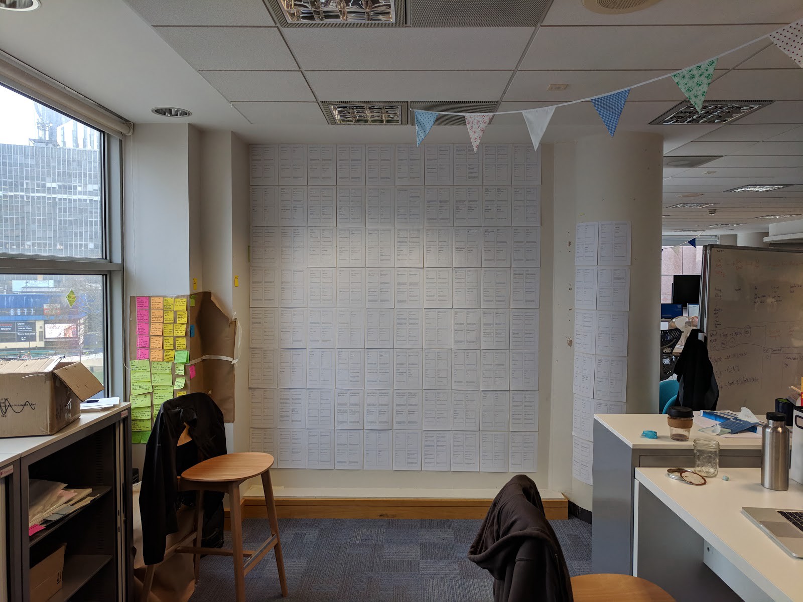
This helped us grasp the size of the problem. The service uses 365 individual pathways. However, pathways are broken down into age and sex. For example there may be 4 versions of any given pathway: adult female; adult male; child female; child male. Once this is accounted for, we’re left with 131 pieces of content.
What did we do?
Content first
Given there are only 131 pieces of content, we were able to optimise our titles and descriptions to fit better with the terms users were actually using.
Our front end dev Shane built a small tool to allow us to compare “before and after” relevancy scores returned by our search engine.
With this tool and analytics of search terms, we were able to tailor our titles and descriptions much more closely to what users were looking for.
Group pathways to anticipate high refinements
With some search terms, there are high levels of “refinement” where the user needs to add more to their term to get better results. One example is “bleeding”. We reckoned we could reduce refinement by grouping pathways under these highly refined terms.
We cut up our printed pathways to make a card deck. Then for the highly refined terms we sorted through the deck to pick appropriate pathways. While this might sound like a lo-fi idea, this human grouping is just as important as searching for matching strings.
Having grouped some of our most refined terms, we optimised our content again to try to make our chosen pathways more relevant.
Consider mental models
When describing a symptom, it’s quite common to point out where the problem is on the body.
But our search engine works by string matching — it doesn’t know that if we’re talking about knees, eyes probably won’t come into it.
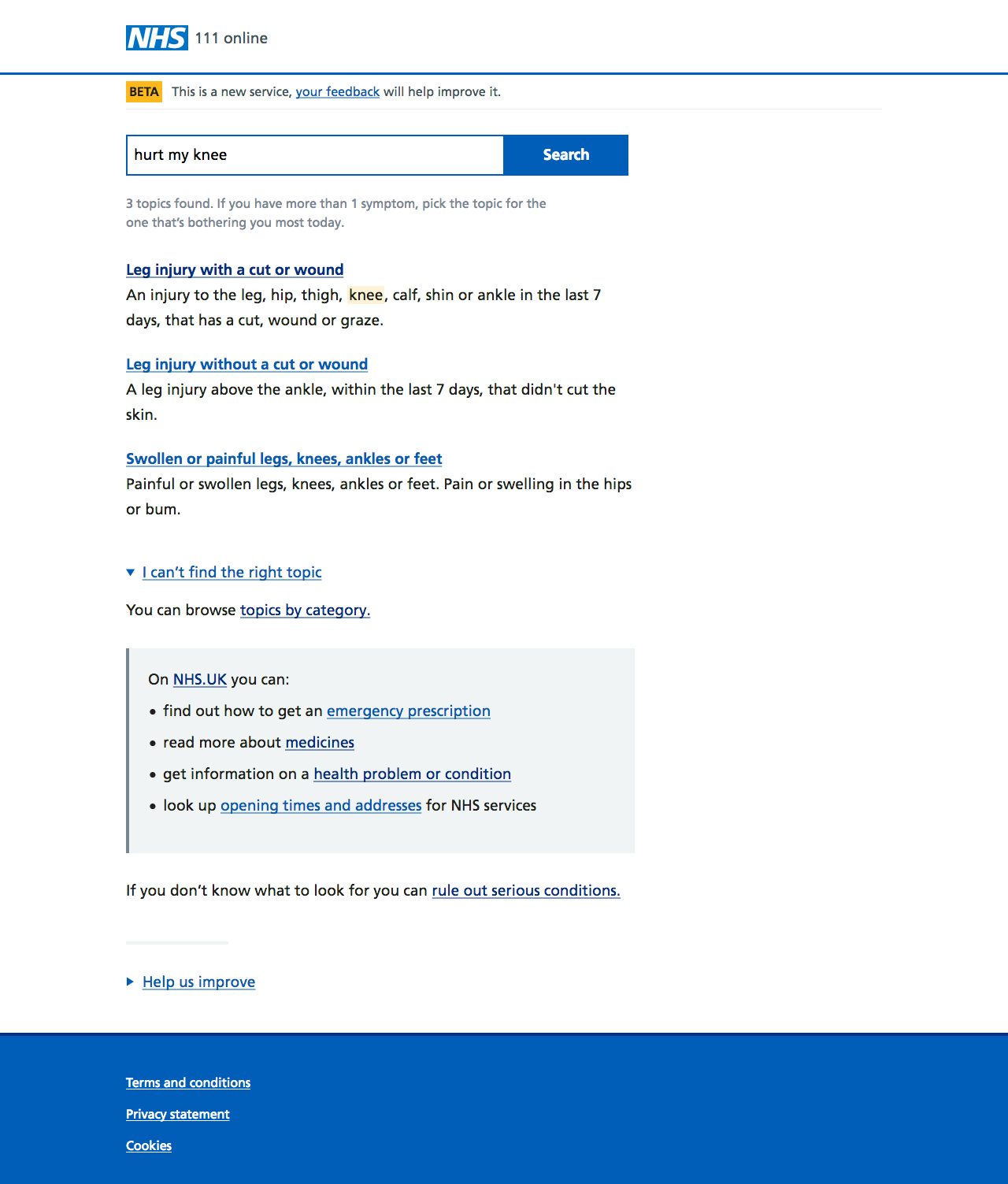
For example, searching for “swollen knee” the results were:
- Swollen or painful legs
- Leg injury — skin not broken
- Eye injury — no damage to surface of eye
- Toothache, swelling and other dental problems
- Swollen or painful groin
- Mouth ulcers
- Ear pain
- Swollen arm
- Swollen or painful face
- Falling, fainting or passing out
While there are results here that make total sense, there are others that seem bizarre — until you remember that we’re just string matching.
Interestingly, we witnessed some users giving spurious results more credence than we expected — simply because those results are “coming from the NHS.” So we added an “awareness” of body parts to our search — kind of a filter, so that if your search terms include a specific body part we’ll only include relevant results.
So if I now search for “swollen knee” I see fewer and more relevant results:
- Swollen or painful legs, knees, ankles or feet
- Leg injury without a cut or wound
- Leg injury with a cut or wound
Revisit the interface
Last but not least, we revisited the user interface.
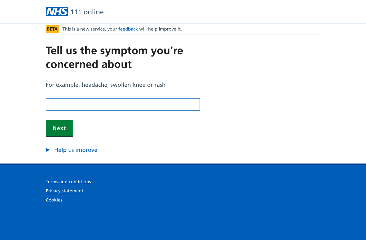
The search interface we were using asked the user to describe what was wrong — imagine a GP saying “so… what seems to be the problem?”
This actually sets up a bit of a disconnect between what we’re presenting to the user and what we need the user to do. We’re asking “what’s wrong?” when we really want users to choose from a set of pathways.
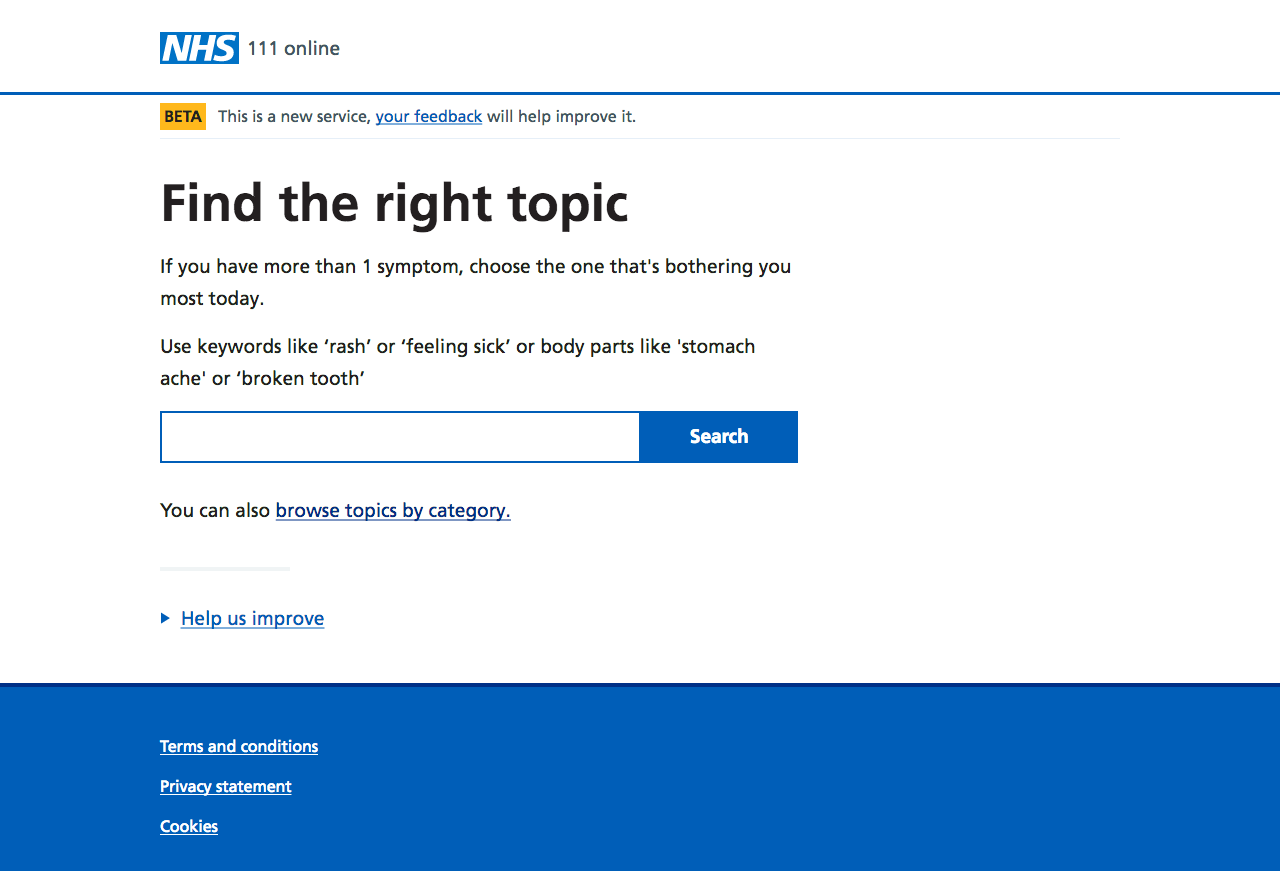
In our revised version, we’re much more specific about the task being set — “find the right topic.” Our advice about search terms is a bit clearer. Finally we’re surfacing a link to browse the available topics.
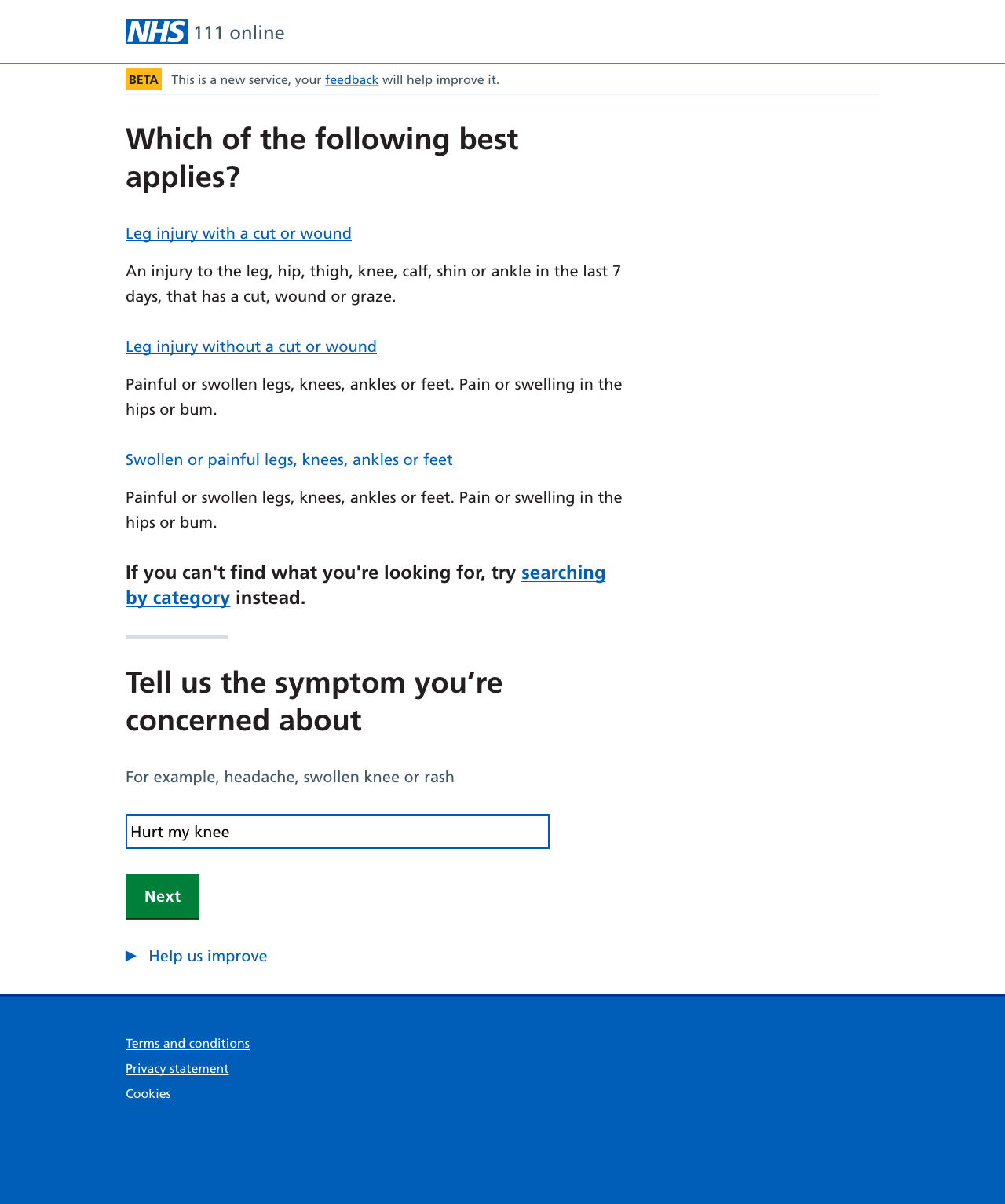
The revised results page is very similar to the existing one. Where we’ve made the most change is where we handle users who are having trouble — we’re now offering:
- a link to improved category based browsing
- links out for things that 111 can’t deal with, such as prescriptions or opening times
- finally a link to a “catch all” pathway which, although it can be long, will rule out serious problems
It’s important to be able to help people find their way out of our product if their needs are better served elsewhere. So showing links to other NHS services is a first step we want to iterate with more tailored onward journeys.
Measuring success
In popup and lab sessions, and we saw users able to more easily find what they need.
The introduction of “body awareness” to the search paid dividends — people were far less likely to be perplexed by seemingly random results.
Our focus on helping people out of the product also proved useful — for example scenarios around looking for info about a condition, or looking to renew a prescription.
Our revised pathway descriptions were released during May 2018, with small tweaks since then. Through June dropouts reduced to 6%, and refinements were down to 14%, which was an encouraging start. The top refined term, “bleeding” had a refinement rate of 17% in March 2018. During June that refinement was down to 9%.
The first part of making our search engine “aware” of the body will be released in late June, with the revised interface to follow shortly after.
And that's where I left it. What follows is a bit more about how successful our work was, and things that I've been mulling over ever since.
Measuring success, revisited
Looking (again, in the simplest possible way) at our analytics for March 2019, I see the following:
- we’ve gone from 9,000 to 128,500 sessions
- dropouts are 7%
- search refinements are at 22%
A disclaimer: I am far from an expert at analytics, and I don’t know how to adapt these figures (or even if I should) for the growth over the year as we’ve rolled the product out.
We’ve improved the interface and the descriptive content for each pathway. We’ve added a “body map” to our search. We know from our usability testing that people are now more able to use the interface we’ve built on top of our content. And yet things are … pretty much the same.
So, what’s going on?
Thanks to Google and the rest, anything you search for can usually be found with varying degrees of ease and search term tweaking. It seems the expectation of any search functionality now is that it encompasses a mind-boggling amount of content.
Perhaps this can lead to problems — things seeming harder to find — when you don’t have a mind-boggling amount of content.
I think search refinements are to be expected. Different people obviously use different words and terms to describe one object or concept. We still get feedback from people struggling to match their description of what’s wrong with them to a suitable pathway, and I’d hazard that while search remains the primary route in we always will.
When set against the expectations of what someone’s primary search interface might be (i.e. the big search engines) it’s not really surprising that they might struggle with our service.
Flip the viewpoint: you could argue we’re asking users to guess the right words to get to the right pathway. When we reset the interface from “tell us what’s wrong” to “find a topic”, what we still didn’t do was give a sense of the amount of things they’d be searching through.
Within the 111 online service, if I’m male and 43 years old* I can choose from 108 pathways. That’s a very long way from a mind-boggling amount of content. It’s not that much at all.
Are there other ways?
I’ve been wondering if there will ever be a point at which we can reliably match a search term straight into the right pathway. Maybe we could use (here it comes) some flavour of natural language processing that can understand the intent behind the search terms.
Although funnily enough the arrival of this kind of technology (in what would need to be a reliable, governable, auditable form) throws the structure and method of NHS pathways themselves into a spotlight, let alone us still asking users to find the right one by searching for it.
So back to March 2019 and I’ve been wondering if a browsing mode might actually be a better way to get people to the right pathway. We’ve already taken a step in that direction with the work done on grouping and categorising pathways. Perhaps if we take away the mystery of what we’ve got to choose from, people might be able to choose easier?
* Yes, I know I often look a lot older.