Getting feedback
We did some interesting work around how we might increase take up of our survey, alongside some thinking around how we can get users to give feedback when they’re using features we’re piloting.
It’s simple enough to ask people to feed back or fill in surveys. But the context of 111 online, and the single section of a healthcare journey it represents adds a bit of nuance. We can’t be loosing popups left right and centre (I mean, not that that’s okay) because we could be interfering with a high acuity situation.
It’s an interesting dilemma. We could create complex relationships around disposition timings and the way we ask people to use our surveys. We could piggyback our in-page feedback mechanism to offer a survey link to people already in “feedback mode”. Lots of potential ideas to work through.
In a pilot setting we could also promote our survey at the resolution of the healthcare journey the user is on. For example a pharmacist could give the user a printed url (on a nice postcard or something, natch) after an emergency prescription journey that asks them if they’re willing to do the survey. A pilot seems an excellent opportunity to try something like this out.
Ways of working
In other fun times I’ve been looking and thinking about our design workflow. We’ve evolved the way we work to try to encompass group sessions and constant sharing.
What we need to now do is tighten up how we record our design decisions. Why we did something, what led us there, and the minutiae of visual changes that got us to a successful interface. How can we create a useful archive without creating burdens of documentation that mean we just won’t keep it up?
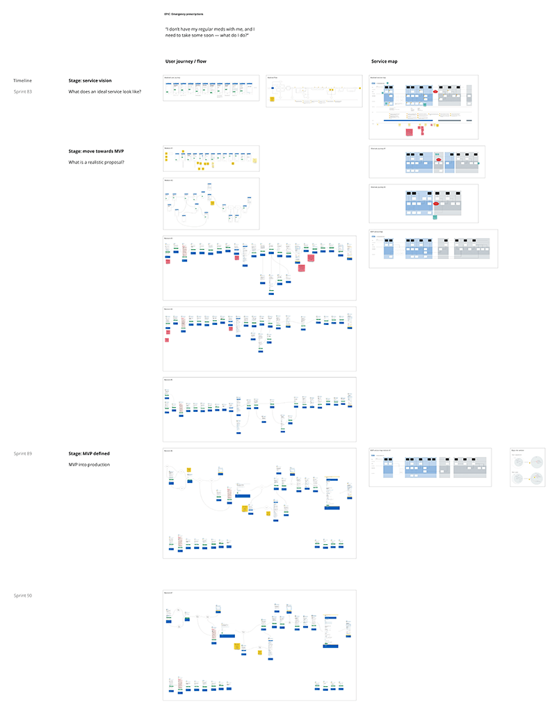
At the moment Miro boards are acting as virtual walls and show visual documentation of change (think row upon row of journey prototypes). This works well in showing the evolution of a given feature as we go through research and prototyping.
However it’s hard to represent the other axes of possible change. For example the design of a journey will evolve over time. Some of the views that journey uses will have lateral changes — for example our emergency prescription feature has a lateral effect on service display views.
As a design function we’re also having a play at writing our tasks using hypotheses just like the cool kids. Along with this is hopefully an increased rigour in our tickets. We use Trello for our sprint boards and backlogs, and I think more discipline in how we maintain individual tasks and backlog items would go a long way.
I guess if we’re lucky we might end up with an “evidence web” (oh I dunno, give it a name). In theory I could drop into a ticket and be linked to a specific board, and specific views within those boards — and then linked to lateral changes to those views.
I’m leery of write-ups as a burden of documentation too far. Conversely, short notation of changes in a written timeline can mean the specific detail of change can be lost. So I think the struggle is to find a very concise but clear way of annotating our changes.
It may well be that we end up with a mess. Or the process becomes more onerous than sitting down and doing write-ups. But it does feel like there’s something there, so we’ll have a go.
