Tuesday
Another Tuesday, another ceremonies day.
We had a good run through from our user researcher Jeanette of the iterations our emergency prescriptions prototype has been through. It’s good to step back and see just how much change happens — and why — in a review like this.
I talked a little bit about reference numbers. How they can be a reassuring thing for users, and the small (nano-sized) way we can use such things to make a pharmacist’s life easier.
Wednesday, Thursday, Friday
Oops, didn’t take notes. I think I’m starting to slip. Still, good effort if you ask me.
The last few days have been a serious review of our service display pages. We did a team review of our multiple service display in the previous sprint and so had a list of things to look at.
Our emergency prescription work has essentially given us a new service type to display, namely “refer, then go”.
I’m going to totally gloss over the fact that it’s actually “refer, then one of you phone the other to make sure everything’s cool, then go”. Oof. This is what happens when you need to fix the plumbing — and that includes the writing of service specifications.
Anyway, what our service display work needs to do is cope with the following service patterns:
- Just go
- Just phone
- Phone or go
- Self-refer online (for example, book a callback)
- Phone first then go (for example, you need an appointment)
- Self-refer then go (our emergency prescriptions journey)
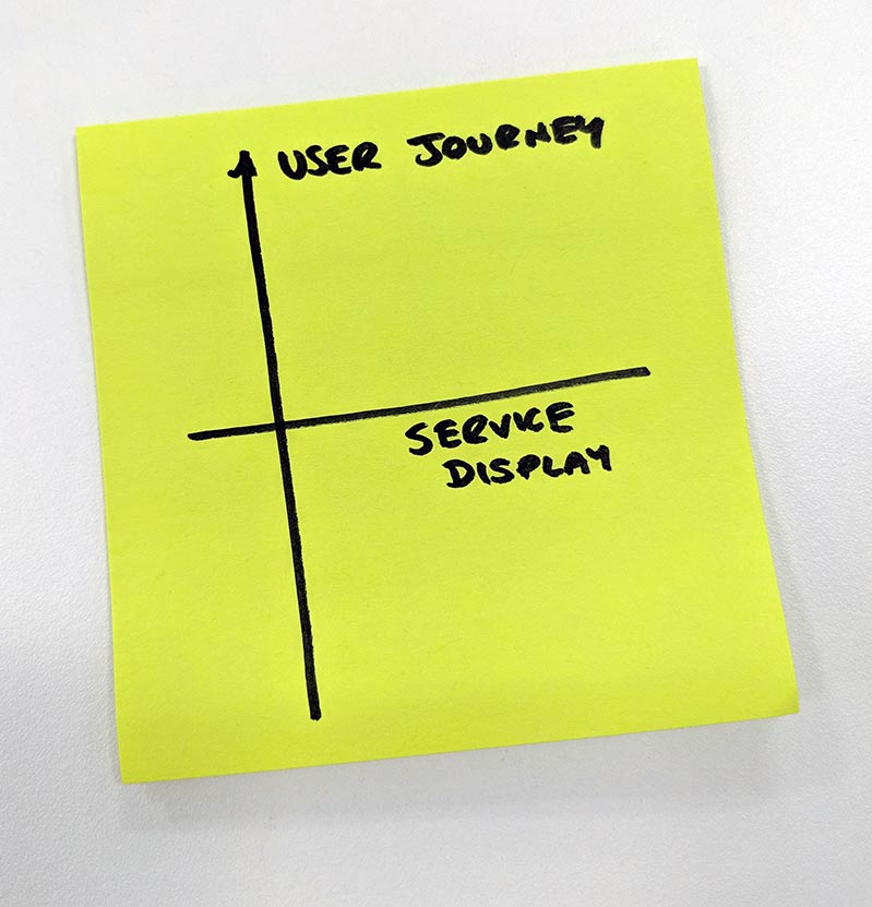
So it’s been a few days of making sure there’s consistency horizontally across views (display of services) as well as utility vertically (the user journey).

As usual, some lessons picked up during research will be applicable in the horizontal, so taking the opportunity to be holistic outside our current vertical slice of service is always nice.