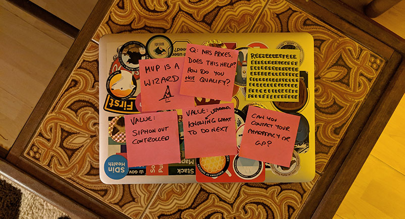
Don’t miss the previous 2 weeks worth of weeknotes, sorry they’re late:
Monday:
Arrived back from holiday with a soggy thump. Most of the day spent catching up. Found out we’d won an award
Sat in on our refinement of tasks for next sprint — this is certainly useful when you’ve got back from a break.
Tuesday:
Ceremonies day.
Some discussion around time-to-product, MVP-itis and how we might deal with it better. As with all products, there’s high pressure to deliver features, and how we balance this with iterating back over MVP work that’s been done. How might we spot and break down the low hanging fruit so we can deliver incremetal improvements as part of business as usual?
Wednesday:
User research with our emergency prescriptions prototype. This was the first session we managed to get users who’d been in the exact situation in front of it.
What followed was a classic “this is crap, we need to burn it down” moment. All the things that in retrospect are so obvious.
We’d been stepping back (what felt like logically) from our idealised journey (see 15th February), but immediately realised we had shifted far too much of a burden onto the user.
We’d backed away from playing back your regular prescription to you so you could select what you’d need. Because MVP, and because it’s by no means certain that in the current landscape this is really possible.
So what’s the next easiest way to find this out? Just ask the user right? They can add things one at a time, we could even build a dm+d lookup to help them get the right things!
Oh wait, of course it’s not easy. People may well need multiple items for an emergency prescription. People won’t always remember exactly the right names, nor the correct dosage or delivery method. People will be under stress while trying to do this. The situation we’re designing for is the exact scenario when people are least likely to have this kind of information with them.
The things that people can answer with ease are the things that we don’t already know:
- the reason why an emergency prescription is needed
- how long until the next dose is due
The things they struggle with are things we already know:
- all the medication (or devices) the prescription consists of
- the strength and delivery method of the medication (pill, spray, etc.)
The fact that we’re finding ourselves designing ways to ask things we already know is a classic symptom of the fragmented organisational structure our products exist within.
In the absence of joined up services, magic logins and so on, the burden we place on users can be unacceptable. As a product team we need to be able to spot very quickly when we’re falling into this trap.
In our eagerness to get to that metaphorical first bit of rope over the ravine when joining up services, it’s far too easy to make the user the information transport mechanism. We ask them lots of things we should already know. We then make them (in some cases literally) join services together:
“We’ve sent through your referral electronically. You must call the pharmacy within the next half hour. But please wait five minutes first.”
We need to avoid this false interoperability like it’s the plague. The first bit of rope over the ravine needs to be the plumbing. Just imagine:
“We’ve sent through your referral electronically. The pharmacy has confirmed the medicines you need are in stock.”
Thursday:
Thursday has been (obviously enough) looking at what we need to change in the journey.
On the plus side we’ve been able to quickly prove that what the system would traditionally asks of users is too much compared to what the system is going to provide in return (essentially a referral). The value exchange there is way off.
And, as always, looking at where we’d got to with critical eyes threw up a whole lot more than “oh, just change the questions”.
Our journey to this point concentrated on meeting the primary user need:
“I don’t have my regular meds with me, and I need to take some soon — help, what do I do?”
We know one way to meet this need is to refer the user to a pharmacy that might be able to help.
But as a product we have to be agnostic. There’s so much variation in the system — a journey could end at a pharmacy or a walk-in centre. It’s not our product that gets to decide exactly how needs are met by services in particular areas. That’s the job of the DOS leads. This adds a huge challenge. How do you concisely communicate what to do next to a user while being service agnostic?
It feels like a lot of this is tied up with being honest. We’ll need to explain service processes to users, warts and all. By pretending services are seamless and intuitive, we simply add confusion by not explaining enough. Navigating healthcare is not seamless, and it’s not (in some contexts) simple.
Friday:
Iteration of the prototype.
Also, it’s nice to work in a team that’s genuinely willing and able to pause or remove tasks from a sprint due to research findings. I don’t want to use the obvious phrase because it’s become devalued by snake-oil peddlers. Suffice to say it’s nice to be able to react quickly and change what we’re doing.